
Plain text vs HTML emails: what our tests show
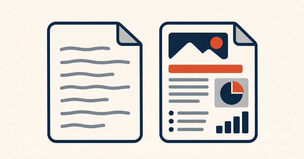
A plain-text style newsletter looks like a personal email, with little formatting, while an HTML newsletter is designed with layout, colours and images. On the same list, our letter-style version was opened by 14.2% of readers against 2.8% for the designed version. Plain styles tend to win on personal newsletters; HTML suits visual content.
The question sounds technical, but it is really about what kind of email your newsletter feels like. A message that looks like it came from a person gets treated like one, by readers and by inboxes. A message that looks like a campaign gets treated like a campaign. Most newsletters sit somewhere in between, and moving toward the personal end can change the numbers more than any subject line.
First, what the terms really mean
"Plain text" gets used for two different things, and mixing them up causes confusion.
The plain-text part of an email. Every email can carry two versions of the same message in one send: an HTML version and a plain-text version. The reader's client picks which to show. This is not a style choice. It is a technical part of the message, and every newsletter should include a good one.
A plain-text style issue. This is the design choice: an issue that looks like an ordinary email, with no header image, no columns, no coloured blocks, just text and links. Technically it is usually still sent as simple HTML, because open tracking and links need it. But to the reader it looks like a letter.
When people compare "plain text vs HTML", they almost always mean the second: a letter-style issue against a designed one.
What our comparison showed
On one newsletter, we sent two versions of an issue to the same list. One was letter-style: plain formatting, one column, text and a few links. The other was a designed HTML version of the same content.
| Version | Open rate |
|---|---|
| Letter-style | 14.2% |
| Designed HTML | 2.8% |
The gap is far too large to be explained by readers simply preferring one look. The more likely explanation is placement: the letter-style version reached the main inbox for many more readers, while the designed version was filed further away, in promotions or spam, where fewer people saw it.
It is one comparison on one list, not a law. A list with stronger engagement and a well-established sending domain would probably show a smaller gap. But it matches what many newsletter writers report, and it is why the Plain Letter template exists.
Why letter-style issues can land better
Providers do not publish exactly how they classify mail, so this is an informed reading rather than a rulebook:
- Heavy design is a bulk-mail signal. Image banners, multiple columns and lots of tracked links are how commercial campaigns look. Gmail's tabs are built to separate that kind of mail from correspondence.
- Less code, fewer problems. Lean HTML is lighter, is never clipped, and has fewer elements that can break or look suspicious.
- Readers reply to letters. A message that looks personal invites replies, and replies are one of the strongest positive signals an inbox can see.
When a designed issue is the better choice
Letter-style is not always right. A designed issue makes sense when:
- The content is visual. Products, photography, recipes, events with images.
- The reader expects a publication, such as a magazine-style digest with several sections, where structure helps people find their way.
- Brand recognition matters, such as a company newsletter where colours and layout are part of the identity.
In those cases the goal is to keep the design lean: one column, real text instead of text in images, light code, and always a proper plain-text part. Our template library has both kinds, each weighed and tested.
How to run your own comparison
- Write one issue, then build two versions with identical content.
- Split your list randomly in two, or use your platform's A/B feature.
- Send both at the same time.
- Compare opens, but also clicks and replies, because open tracking is imprecise.
- Repeat on a second issue before drawing conclusions.
Frequently asked questions
Do plain-text emails have better deliverability?
Often, for personal and editorial newsletters, because they look like correspondence rather than campaigns. It is not guaranteed. Authentication, reputation and list quality still matter far more than design.
Can I track opens on a plain-text email?
Not on a true plain-text message, because open tracking relies on a tiny image that only works in HTML. That is why most "plain" newsletters are sent as very simple HTML that looks like plain text.
Should every newsletter include a plain-text version?
Yes. Sending both an HTML and a plain-text part in the same message is the normal shape of legitimate email, and some readers and devices use the plain-text part. Check what your platform generates and fix it if it is messy.